We sample colors inside the detected letters. Click a swatch to replace an embedded color.
Compatibility: Some font viewers and apps display fonts with kerning turned off, so this spacing may look different there. Kerning-aware apps use the spacing saved in your font.
Select a characterClick any character in the preview to edit its shape and spacing.
—
Selected characterClick a character in the preview
Select a pair in the preview or type any two characters below.
Custom kerning pair
AVAVAV
Pair kerning compatibility: Custom pair spacing is saved in the font, but some viewers, including Windows Font Viewer, display text without pair kerning.
Preview
Single color
Letter checker
Type one character, then submit it.
Test colors
Your font preview will appear here after the letters are ready.
I Have Every Letter. How Do I Turn It Into a Font?
Use the tool above to turn handwriting, brush lettering, PNG letters, custom symbols, or outlined letter shapes into a real, installable OTF font—without learning professional font-design software.
You already did the creative part. This tool handles the technical part: finding each character, separating it from its neighbors, correcting the labels, fixing spacing, previewing real words, and building the font file.
turn my handwriting into a fontmake my own fontturn outlined letter shapes into a fonttype instead of copy and pastesave time on my comic
The fast route
Choose a clear image containing your characters.
Adjust the Letter Mask until the characters are black and the background is white.
Click Find separators, correct the lines, and refresh the separated letters.
Use Font Defaults, Character, and Pair Kerning while testing real words.
Name the font and click Download .OTF.
Before you start: use the clearest letters you have
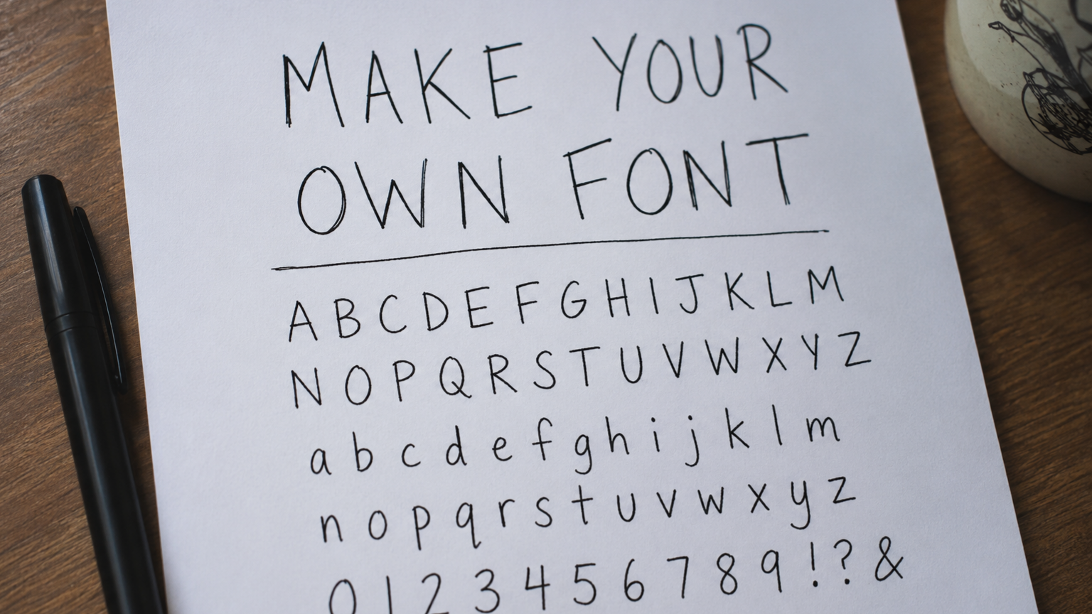
The best source is the version that already looks most like the font you want. That can be a scan of handwriting, brush lettering, marker sketches, a Procreate export, logo letters, a custom alphabet, or artwork arranged into rows.
Use a high-resolution image. The app keeps the original pixels when it builds the separated letters.
Use a white or very light background whenever possible.
Make the characters dark enough to separate from the background.
Leave visible space between neighboring characters. Touching letters take more manual correction.
Keep each row roughly horizontal.
Include uppercase, lowercase, numbers, and punctuation you expect to type.
Check the specimen before you begin. A font can only contain the characters that are actually present and correctly labeled. Look for missing, duplicated, or substituted characters—especially when the image was generated by AI.
Do not have a font image yet?
Click Tutorial at the top of the tool. The optional AI step lets you describe the style you want, builds a carefully formatted prompt, and gives you a Copy prompt button. Paste that prompt into the image-capable LLM you prefer, generate the image, save it, and return here.
Describe the look, not the software. Phrases such as “soft marker lettering with uneven hand-drawn edges,” “bold retro sign lettering,” or “rounded stitched felt letters” are more useful than asking for a particular font file format.
1
Mask: tell the app what counts as a letter
After you choose an image, the tool opens the Mask tab. The Letter Mask is not the final artwork. It is the black-and-white map the app uses to find the characters.
Adjust the luminance curve
Drag the points on the Luminance curve. Your goal is simple:
The parts of the characters you want to keep should look solid black.
The background, paper texture, dust, and shadows should look white.
Small intentional details should remain connected to their characters.
Drag the Letter Mask canvas to move around. Scroll to zoom, use the Zoom slider, or click Fit to see the entire image again. Click Reset when the curve gets worse and you want the starting shape back.
What good looks like: the characters are readable as black silhouettes, the white space between them is clean, and random background marks are mostly gone.
Do not erase character edges just to make the mask look clean. The mask is used to find the shapes. If a thin stroke disappears here, the app may not recognize it as part of the character.
When the mask is usable, click Find separators. The tool will analyze the rows and place curved separator lines between neighboring characters.
2
Separate Letters: check where one character ends and the next begins
This tab shows Your Image and Separated Letters. The lines on Your Image tell the app how to divide each row. The right side shows the result.
Correct the separator lines
Double-click empty space to add a separator.
Drag a separator handle to move or curve the line around a character.
Click a separator line to delete it.
Use Clear all lines only when you want to start the separator layout over.
Use Zoom and Fit images to inspect small punctuation and tight spaces.
What good looks like: every separated character contains all of its own marks and none of the neighboring character.
Refresh after changing the lines
When a separator changes, the Separated Letters canvas becomes covered by a light white overlay. A small Refresh letters button appears in the upper-right corner of that canvas. Click it. The button immediately changes to show that the refresh started.
Wait until the updated letters and labels appear. Large, full-resolution images can take longer because the tool is preserving the source quality rather than silently shrinking the upload.
Correct the character labels
The app tries to identify each separated character. Click a label when it is wrong and type the correct character. Check uppercase and lowercase carefully. Also check similar punctuation such as straight quotes, curly quotes, commas, periods, brackets, and slashes.
The labels control the keyboard mapping. A beautiful letter labeled incorrectly will appear when the wrong key is pressed.
3
Adjust: make the font work in real words
A set of individual letters can look correct and still feel wrong when typed. This is where you fix the things people usually describe as “the spacing was hard” or “the handwriting font’s kerning was wrong.”
The small text area above the large preview is where you type test words and sentences. The large rendered preview below it is where you click characters and character pairs when the relevant settings tab is open.
Font Defaults: adjust the whole font
Side bearingThe default breathing room around every character.
TrackingExtra spacing added across the entire line of text.
Global kerningA broad adjustment to how neighboring characters sit together.
Word spaceThe width of the blank space between words.
WidthMakes the entire font narrower or wider.
HeightMakes the entire font shorter or taller.
Line heightControls the vertical distance between multiple lines of text.
Start here before changing individual characters. Type a few real samples and adjust only what is obviously wrong.
Useful test text: names, product titles, a lowercase sentence, an all-caps phrase, repeated letters such as “minimum,” and the actual words you created the font to use.
Character: fix one letter without changing the rest
Open the Character tab.
Hover over the large rendered preview.
Click the character you want to edit.
Use the controls for size, tilt, width, height, position, and the space before or after that character.
SizeScales the character evenly.
TiltRotates the character slightly left or right.
Width / HeightChanges one dimension without changing the other.
Move left / rightChanges the character’s horizontal position.
Move up / downFixes a character that sits too high or too low.
Space before / afterChanges the room immediately around this character.
Use the arrow buttons to move to the previous or next character. Use Reset to undo the selected character’s adjustments, or Reset all to remove every character-specific adjustment.
Pair Kerning: fix one awkward pair
Kerning is the spacing between one specific pair, such as AV, To, Wa, or ry. Use it when the overall spacing is good but one combination still looks wrong.
You can load a pair in either of two ways:
Put the typing cursor between two characters in the small test-text area, then click Use characters beside cursor.
Open Pair Kerning, hover over the large rendered preview, and click the pair the app highlights.
Move the pair slider or type a number. A negative value pulls the pair closer. A positive value pushes it farther apart. Click Save pair to keep the rule. Use Remove pair when that custom rule is no longer needed.
What good looks like: words feel even. No pair crashes together, and no pair creates a distracting hole.
4
Name & Download: create the real font file
Open Name & Download, enter the font family name, and click Download .OTF. The result is an OpenType font file—not a fake text image and not a copy-and-paste workaround.
Install the font
Windows: right-click the downloaded OTF file and choose Install or Install for all users.
macOS: double-click the OTF file, review it in Font Book, and click Install Font.
Close and reopen any app that was already running before the installation.
Test uppercase, lowercase, numbers, punctuation, repeated letters, and several lines of text in the app where you intend to use the font.
Important for Cricut users: this tool creates a normal outline font from the visible character shapes. It does not convert the artwork into a true single-line or centerline writing font.
Fix the most common problems
The mask removes thin strokes or small details
Return to Mask and make the luminance curve less aggressive. The black areas should include every stroke you want the app to recognize.
Two characters are stuck together
Add a separator by double-clicking the space between them, then shape the line so it passes through the white gap without cutting either character.
One separated letter contains part of the next letter
Move or curve the separator toward the correct boundary, then click Refresh letters.
A character types from the wrong key
Go back to Separated Letters and correct its label. The label—not the visual position—decides which key produces the character.
The font looks fine one letter at a time but bad in words
Start with side bearing and tracking. Then use Pair Kerning only for the combinations that still look wrong.
Line height seems to do nothing
Line height changes the distance between lines. Put at least two lines in the test-text box so the difference is visible.
I cannot select a character to edit
Open the Character tab and click the character in the large rendered preview. The small text area above it is only for typing the test text.
The pair rule does not seem to change anything
Confirm the exact two characters are loaded, change the value, and click Save pair. Test that same pair in the rendered preview.
A large image takes a long time
The app does not impose the old 24-megapixel cutoff or silently downscale the upload. Full-resolution processing can use substantial browser memory, so wait for the current action to finish and avoid repeatedly clicking the same button.
Questions people ask before making their own font
Can I turn my handwriting into a font without using a template?
Yes. The app works from a normal image. The characters still need enough separation for the tool to find them reliably, but you do not have to fill out a traditional font worksheet.
Can I make a font from PNG letters or a Procreate export?
Yes. A high-resolution PNG with dark characters on a light background is a strong input. Export at the highest practical quality and leave visible space between characters.
Can I turn Illustrator paths or logo letters into a font?
Export the arranged letters as a high-resolution image and upload it. The current tool reads an image rather than importing SVG paths directly.
Does the tool keep my exact letter shapes?
The Letter Mask is used to detect and group the characters, while the separated-letter artwork is copied from the original full-resolution pixels. Later font conversion still turns that artwork into font outlines, so inspect the preview before downloading.
What is the difference between tracking, side bearing, and kerning?
Side bearing is the default space around each character. Tracking changes spacing across the whole text. Kerning fixes the space between one specific pair.
Do I need every character?
No. The font can contain only the characters you need. Missing characters will not magically appear, so include everything required for your actual project.
What file does the tool download?
An installable OpenType font with the .otf extension.
Does this make a single-line font for Cricut pens?
No. It creates a standard outline font. A true single-line writing font requires a different centerline-based process.
Is my uploaded image sent to a server?
The font-building work in this tool runs in the browser. The page still downloads the libraries needed to run the app, but the source image is handled locally by the browser rather than being submitted through a normal upload form.
This is for people who already have the letters
Real people describe the problem in practical language, not as a desire to become type designers:
I wrote the letters as paths.
Turn my handwriting into a font.
Send the .ttf or .otf.
Save time on my comic.
Text people in my own handwriting instead of the usual.
Copy and paste your text would be extremely annoying.
That is the point of the tool above. You bring the visual idea. The app helps turn it into something you can type.
You do not need to learn font design just to finish one font
If you already drew the letters, the remaining work should feel like finishing—not starting over. Clean up the mask, check the separator lines, correct the labels, make the spacing feel right, and download the OTF.
Know someone who keeps copying and pasting individual letters? Send them this tool.
About the audience language used in this tutorial
The page language was shaped by public questions, forum posts, reviews, and beginner-facing font tools from people trying to turn existing lettering, handwriting, symbols, or vector shapes into a usable font. Short phrases are used for message calibration; the instructions themselves describe the current Get More Done Fast tool.
You Already Made the Letters. Why Is Turning Them Into a Font Still So Hard?
For everyone searching “turn my handwriting into a font,” “make my own font,” or “turn shapes into letters to make a font”—this is the missing step between the letters you created and a font you can actually type with.
“I wrote the letters as paths.”
“How do I turn my handwriting into a font?”
“It gets tiring writing every single letter.”
“I want to write a card without bubble letters.”
Those are four different people with four different projects.
But they are all asking the same question:
I already have the letters. How do I make them work like a font?
The problem is not making the letters
You may already have:
your handwriting
brush lettering
marker sketches
notebook notes
a custom alphabet
letters drawn in Procreate
shapes made in Illustrator
a hand-lettered logo
lettering for a comic or children’s book
Those are exactly the kinds of things people describe when looking for a way to make their own font. Beginner-focused tools also talk about “raw photos of handwriting,” “brush lettering,” “marker sketches,” “notebook notes,” “SVG shapes,” and handwriting that has already been created.
You already did the part that required taste.
You chose the shape of the a.
You decided how crooked the t should be.
You made the g strange on purpose.
You figured out what the whole alphabet should feel like.
The difficult part comes afterward.
How do you separate every letter without cutting pieces off? How do you tell the computer which character is which? How do you make the letters sit on the same line? How do you stop one pair from colliding while another pair has a huge gap? How do you turn all of that into an actual .otf file?
That is not a drawing problem.
It is a finishing-the-project problem.
You should not have to become a type designer to finish one font
Someone looking for a simple font-making program wrote, “I can’t for the life of me figure out how to use FontForge and similar programs.” Another person wanted an easy way to create one font but was not willing to pay $30–$40 every month just to do it.
Even a font-making company describes the traditional process as “painful,” involving “countless hours learning complex software” and tedious spacing and kerning work.
There is nothing wrong with professional font software. It exists for people building professional type families, refining curves point by point, creating multiple weights, supporting many languages, and controlling every technical detail.
But that is not what most people asking these questions want.
They want to:
make a font from their handwriting
turn outlined letters into a real font
use their own lettering in a comic
type notes that still look handwritten
use custom letters in a brand
preserve someone’s handwriting
stop drawing the same letters repeatedly
They want the result.
They do not necessarily want a new profession.
“It gets tiring writing every single letter”
A webcomic creator explained the problem plainly: they liked using their own handwriting, but “it gets tiring writing every single letter” when they could be typing instead. Another person wanted their own handwriting as a webcomic font but said writing consistently required nearly all of their concentration.
That is one of the clearest reasons to make a font.
Hand lettering gives a comic personality. Redrawing every sentence gives its creator a repetitive-motion problem.
A working font lets you keep the voice of the lettering while changing the words as quickly as you can type them.
That can mean:
faster speech bubbles
faster captions
easier revisions
consistent lettering across pages
editable dialogue instead of flattened artwork
A Calligraphr user described the outcome as turning their handwriting into a font “to save time on my comic” and being “0% disappointed.”
The same idea applies outside comics.
A children’s-book creator wanted to use their own handwriting but said inconsistent letters were making the pages look ugly. A Goodnotes user said they loved their notes much more after making a font from their handwriting.
The goal is not to remove the human style. It is to stop recreating it from scratch every time.
“I wrote the letters as paths”
Handwriting is only one version of this problem.
Designers also arrive with completed shapes.
One Adobe Community user had already drawn the letters as paths, expanded the strokes, and converted everything into shapes. The remaining question was simple: “I want to save the letters as a new font. How do I do this?”
That situation is surprisingly common.
You might have designed:
a custom wordmark
an alphabet for a fictional world
letters made from matchsticks, thread, fur, water, or collage
a retro display style
letters for packaging
a logo that now needs a complete alphabet
an AI-generated character sheet
an illustrated alphabet for digital products
You do not need software to invent those letters. They already exist.
You need something that can recognize where each letter begins and ends, assign it to a key, and package it as a font.
That is why the tool above begins with an image instead of an empty vector editor.
It assumes you came here because you already made something.
Your letters should not lose what made them interesting
One user trying to create a handwriting font found that tracing “takes all the texture of my letters away.” More recently, someone who made a font from matchsticks asked how to keep the matchstick heads visible instead of having the artwork reduced to a solid outline.
That frustration matters.
A rough edge might be a mistake.
It might also be the entire reason the font is worth making.
The uneven ink, worn marker, fuzzy material, cross-hatching, paint texture, stitched seam, or imperfect curve may be the style—not noise that needs to be erased.
This is why the tool uses the black-and-white mask to find the letters but returns to the original uploaded pixels when it creates the separated character sheet.
The mask answers:
Where is the letter?
The original image answers:
What does the letter actually look like?
Those should not be confused.
A font should be usable, not merely downloadable
A real font is different from an image generator that creates one picture containing words.
It is also different from a “font keyboard” that makes you copy and paste special characters into another app.
A real font maps your letters to normal characters so you can type, delete, edit, search, copy, and rewrite the text.
That expectation appears repeatedly in the language people use. They ask for an actual TTF or OTF, a font they can install, or something that can be imported into the app where they already work. Current beginner tools make the same promise using phrases such as “real TTF or OTF,” “each shape is mapped to a character automatically,” and “a character you can type with.”
The tool above exports an OpenType font.
That means the result is not just a preview of your lettering. It is a font file you can install and test.
The hidden hard part is not the alphabet. It is the space around it.
You can love every individual letter and still dislike every word the font produces.
That is usually a spacing problem.
A font must decide:
how much room belongs before each character
how much room belongs after it
how wide a normal space should be
how high or low a character should sit
how close particular pairs should move together
This is why letters that look perfect in isolation can suddenly look wrong in a sentence.
The tool above lets you adjust the whole font first, then fix one character or one pair only when necessary.
That order matters.
You should not have to inspect every possible combination before typing your first word. Start with the overall result. Then fix the places your eyes keep noticing.
Do not adjust numbers because they sound technical. Adjust the word until it looks right.
“I want to keep the original look”
The best result is not the most mechanically perfect one.
It is the one that still looks like the source.
That may mean your letters remain:
slightly crooked
unusually wide
rough around the edges
heavily textured
visibly handmade
inconsistent in a way that feels alive
A recent designer using a handwriting font noticed that the repeated letters had no variation and therefore looked obviously digital. Other users pointed out that alternate versions can help keep handwriting feeling alive.
This tool currently creates one mapped version of each character. That is enough for a clean, working font and many practical uses.
It will not automatically reproduce every natural variation of real handwriting. That would require several versions of common letters and rules that rotate among them.
So the honest target is not:
Nobody will ever know this is a font.
It is:
This still looks like my lettering, and now I can type with it.
This is also a way to keep handwriting from disappearing
Some people are not trying to make a product.
They are trying to preserve a person.
One family looked for a way to turn a mother’s handwriting into a font after an ALS diagnosis so that she—and later her family—could continue using it to type letters. Another person wanted to preserve a father’s distinctive handwriting. Services aimed at parents use phrases like “save your children’s handwriting forever.”
A handwritten note can be scanned.
A handwriting font can keep writing new notes.
Those are not the same thing.
You could make a font from:
a parent’s cards
a grandparent’s recipes
a child’s first clear alphabet
your partner’s handwriting
letters from someone who has died
your own handwriting before an illness changes it
The result will never replace the person or the original pages.
But it can preserve part of how their words looked.
One important Cricut warning: a normal font is not automatically a single-line font
Cricut users often ask why a machine draws outlines or “bubble letters” when they wanted a single pen stroke. One user described it as frustrating that the machine “always writes like it cuts.” Another asked for a single-line font specifically because they wanted to write a card without bubble letters.
The font produced by this tool is a normal outlined OpenType font.
That is appropriate for:
typed text
printing
graphic design
cutting filled letter shapes
normal desktop-font use
It is not automatically a true single-line writing font for a Cricut pen, foil tool, engraver, or plotter.
Changing a normal font from Cut to Draw can cause the machine to trace both sides of every outline, producing the bubble effect. Cricut users describe true writing fonts as having a single path for the pen to follow.
So use the tool above to make a normal font from your lettering.
For genuine single-line machine writing, you need a separate centerline or stroke-font workflow.
Who this tool is really for
This is for the person who says:
“I want to turn my handwriting into a font.”
It is for the person who says:
“I wrote the letters as paths.”
It is for the person who says:
“I want to keep the original look.”
It is for the person who says:
“It gets tiring writing every single letter.”
It is for the person who says:
“I can’t for the life of me figure out FontForge.”
It is for anyone who already has the visual idea and needs the computer to understand that these shapes are letters.
Not stock lettering.
Not a close-enough handwriting font.
Not an image containing one fixed sentence.
Your letters. Your keyboard. Your font.
What could you make with it?
You could turn your lettering into:
a comic-dialogue font
a children’s-book font
a personal journaling font
a classroom font
a font for invitations or cards
a custom brand font
a tabletop-game alphabet
a fictional-language font
a font made from found objects
a font based on a family member’s handwriting
a font for packaging, labels, stickers, or social graphics
People are already looking for ways to use handwriting and custom lettering in comics, notes, stories, cards, branding, invitations, classroom materials, digital products, social graphics, and packaging.
The important part is not picking the most impressive use.
It is making the font only you could have made.
You already did the creative part
The letters are the idea.
The font file is the infrastructure that lets the idea travel.
Once your lettering becomes a font, it can move into new sentences, new pages, new projects, and new hands without being redrawn every time.
That is the reason this tool exists.
Not to teach you every part of professional type design.
Not to replace the strange details that made your lettering worth keeping.
Not to turn your work into something cleaner but less yours.
You already made the letters. Now make them usable.
Get More Done Fast!
"Productivity hacks, free tools, time-saving tips, good deals and more sent directly to your inbox." - Andrew Fisher
Thank you for subscribing!
Have a great day!
FAQs:
Because drawing the letters and building a working font are different jobs. People describe arriving at this exact point with phrases like “I wrote the letters as paths,” “I already made the alphabet,” and “I want to turn shapes into letters to make a font.” The creative work may be finished, but the computer still needs each shape separated, matched to the correct keyboard character, aligned, spaced, packaged, installed, and tested.
The tool above handles much of that finishing work without forcing you into a professional font editor. When the automatic result needs more judgment than the software can provide, I can help turn the source you already made into a practical plan, identify what is actually blocking the font, and focus the work on the changes that affect real words rather than making you learn an entire type-design discipline.
Yes. This is the outcome people mean when they search for ways to “turn my handwriting into a font,” “type with my own handwriting,” or make a “real, usable font.” A standard font file maps your handwritten letters to normal keyboard characters, so the resulting text remains editable instead of becoming one fixed picture.
The important distinction is between making a font that technically installs and making one that feels pleasant to use. A first export may reveal letters that sit too high, words that feel too loose, or pairs that collide. Use the live preview to fix the most visible problems. For a personal project, that may be enough. For a comic, product, client project, or brand asset, I can review the working font in context and help finish the details that make it feel intentional rather than merely generated.
Yes, provided you can export the paths as a clear image with every character visible and separated. An Adobe Community user described this exact situation with the phrase “I wrote the letters as paths” and wanted to save the completed shapes as a font. Font-making tools also explicitly target people who want to turn existing vector artwork and letterforms into real fonts.
Use the cleanest version of your artwork, place the characters on a plain background, and leave obvious white space between them. Do not rasterize the image at a tiny size. The source should preserve enough edge detail for the mask and separator tools to locate each character accurately.
When your file contains compound paths, overlapping pieces, unusual negative spaces, or several disconnected parts per letter, I can help determine whether the fastest route is to adjust the source image, fix the separation, or clean the shapes before font generation.
Yes. The tool begins with an image, so the letters can originate in almost any drawing or design application. People looking for this workflow commonly arrive with vector shapes, handwriting photos, marker sketches, brush lettering, notebook notes, or artwork that already looks the way they want.
The source application matters less than the exported sheet. Every character needs to be fully visible, clearly separated, correctly ordered, and large enough to retain its shape. AI-generated character sheets require extra inspection because image generators frequently omit characters, substitute symbols, repeat letters, or change the style halfway through the alphabet.
I can help evaluate a generated sheet before you spend time correcting it, identify which characters are usable, create a repair plan for missing or inconsistent letters, and determine whether the remaining work is better handled in the image, the font builder, or the final font.
You can upload the image you already have. Traditional handwriting-to-font services often begin with a grid that must be printed, completed, photographed, and uploaded. That works, but people repeatedly ask whether they can use an existing handwritten note, raw image, or alphabet instead of starting over on a service-specific template.
This tool is intended for the person who already has the letters. Your image does not need template markers or prescribed boxes. It does need enough white space for the app to locate boundaries between characters.
An existing sheet can still require preparation when the letters overlap, the background is uneven, the photograph is distorted, or the characters appear in an unknown order. I can help turn a difficult scan or artwork file into a source sheet the tool can read without asking you to redraw the alphabet solely to satisfy a template.
A strong source image has a plain background, dark and clearly visible letters, generous margins, complete characters, and enough space between neighboring characters that each one can be separated without cutting through it. Calligraphr’s beginner guidance similarly recommends a clear scan or photo and notes that a felt-tip pen generally produces a stronger source than a thin ballpoint.
Keep the camera square to the page. Avoid shadows, paper wrinkles, perspective distortion, compression artifacts, and glare. Export from a drawing app rather than taking a screenshot when possible. Use one consistent scale unless size variation is part of the design.
A technically large image can still be a poor source when the characters are tiny inside it. Conversely, a modest image can work well when the letters fill the available space. I can inspect the actual source and tell you which preparation change will produce the largest improvement before you begin manually correcting separators and spacing.
The white space tells the app where one character ends and the next begins. When letters are crowded together, their marks can appear to be one connected object. That leads to merged characters, misplaced separator lines, partial extractions, or one character stealing part of its neighbor.
The space does not need to look attractive because the source sheet is not the final font. The final spacing is controlled later through side bearings, tracking, character adjustments, and pair kerning. The source sheet should prioritize accurate separation rather than resemble a finished sentence.
Leave especially generous room around wide characters, punctuation, flourishes, long crossbars, and letters with detached dots or accents. When the only available artwork is tightly packed, I can help determine whether to separate it in the source image, create custom separator paths, or reconstruct a few ambiguous characters without damaging the rest of the alphabet.
The current version is intended to retain the uploaded image’s pixel dimensions rather than silently imposing an arbitrary megapixel cutoff. The displayed canvas may appear smaller because it is fitted inside the interface, but visual zoom is not the same as changing the underlying source resolution.
Very large images still require substantial browser memory. One full 7,096 by 3,548 RGBA pixel buffer alone occupies roughly 100 megabytes before temporary canvases, masks, extracted letters, OCR data, and browser overhead are counted. This is why large files can feel slow even when no quality is intentionally removed.
Start with the full-resolution source, but do not add empty pixels that provide no useful letter detail. When a large file freezes, I can help distinguish a display issue from actual resampling, identify unnecessary memory pressure, and prepare a source that preserves the meaningful detail without forcing the browser to process a billboard-sized blank background.
The Letter Mask converts the source into a simplified black-and-white interpretation so the app can decide which pixels belong to letters and which belong to the background. It is primarily a detection tool. It helps locate lines, components, gaps, and potential character boundaries.
The mask is not supposed to become a prettier version of the artwork. It should make every intended stroke solid enough to detect while keeping the background clean. Small decorative details that disappear from the mask may still remain visible in the source-image extraction, depending on how the final character is built.
This distinction matters for textured lettering. One Adobe user complained that tracing “takes all the texture” away. A useful workflow separates location detection from visual preservation instead of assuming every gray pixel is disposable.
I can help tune a difficult source when one mask setting either erases the texture or fills the entire page with noise.
Adjust it for reliable detection, not for cosmetic perfection. Drag the luminance curve until the important letter strokes are solid black and the background is mostly white. Ignore tiny variations that do not affect whether the app can locate a character.
Preserving texture and detecting boundaries are separate goals. People creating handmade fonts often want to keep “actual ink,” “natural imperfections,” or a textured look that generic tracing removes.
A mask that includes every speck may create hundreds of false components. A mask that is too aggressive may break thin strokes, erase punctuation, or remove the dots from lowercase i and j. Find the simplest mask that keeps each character structurally complete.
When no single curve works across the whole page, the source may need local cleanup or separate processing for light and dark characters. I can diagnose that before you spend an hour moving points without knowing why the result never stabilizes.
Separator lines tell the app where to divide a row of artwork into individual characters. They are estimated from areas with little or no detected ink. The automatic lines are a starting point, not a declaration that every boundary is correct.
They can be wrong when a character leans into the next one, a flourish crosses the gap, punctuation is unusually small, the page is angled, or the mask contains background noise. A wide letter may also contain a large internal opening that resembles a gap between two characters.
Use the editable handles to move a separator through genuine empty space. Add a line where two characters were merged. Remove one that cuts through a single character. Then refresh the separated letters.
For a complicated sheet, I can review the boundaries as a system rather than fixing isolated symptoms, which is often faster than repeatedly refreshing and discovering a different character broke each time.
First decide whether the problem exists in the source, the mask, or the separator placement. Touching letters may need a separator curved through the narrowest available space. A split letter may need a separator removed, a mask adjustment, or recognition that the letter naturally contains disconnected parts.
Dots, accents, quotation marks, colons, semicolons, and decorative fragments are especially easy to misclassify. The goal is not necessarily one connected blob per character. The goal is for all intended pieces of one character to end up in the same extracted region.
Refresh only after the separator layout reflects the source correctly. Repeatedly refreshing an incorrect boundary does not improve it.
When a letter cannot be separated without cutting its neighbor, the reliable fix may require editing the original image. I can identify the smallest source edit needed so you do not redraw characters that were already usable.
Small, pale, narrow, or detached marks can fall below the detection threshold. A period may look like dust. An apostrophe may resemble image noise. A thin numeral 1 may disappear when the mask is adjusted for heavier characters. Characters near the image edge may also be clipped or excluded from the detected row.
Check the mask first. Confirm that the missing character appears as visible black ink. Then inspect the separators to ensure it was not merged with a neighbor. A mark can exist in the extracted image but still lack the correct label.
People making fonts often focus on A through Z and discover later that practical text also needs numbers, apostrophes, quotation marks, hyphens, parentheses, currency signs, and sentence punctuation.
I can audit the character inventory against the actual use case, so a font intended for a comic, brand, classroom, wedding, or product label includes what the project will really type.
Character recognition is making an educated guess from isolated artwork. Highly stylized letters, unusual punctuation, decorative forms, handwriting, and intentionally distorted alphabets may not resemble the standard examples the recognizer expects.
This is why every extracted label remains editable. Click the label and replace it with the exact keyboard character that should produce that image. The visual shape matters less than the mapping. A symbol that looks nothing like a conventional A can still be assigned to A when that is how you want it typed.
Review labels in sequence rather than trusting them because most appear correct. One mistaken label can create a missing character and a duplicate elsewhere.
For a large or unconventional set, I can perform a mapping audit, compare the source order with the extracted sheet, and catch the kinds of substitutions that are easy to overlook until a client types the first real sentence.
You can preserve those details in the source and in the separated-letter review, but the final result depends on how the font is generated. A conventional outline font stores shapes rather than a full-color photograph of every character. Extremely fine texture may be simplified, filled, or lost when converted into outlines.
This is a known frustration. People explicitly ask how professionals retain a “textured” look after tracing, while newer handwriting tools promote keeping “natural imperfections” and “actual ink.”
Use a large, sharp source and avoid over-cleaning the mask. Then test the exported font at the actual size where it will be used. Texture that looks beautiful at 200 pixels may turn into noise at 16 pixels.
I can help determine whether your project should remain a standard outline font, use simplified texture, or move to a specialist color-font or image-based workflow.
Three different effects can look like lost quality. The interface may be displaying a large source at a reduced zoom. The mask may be shown instead of the original pixels. Or the extraction process may be using a simplified black-and-white representation rather than the full source appearance.
The current workflow is designed to use the mask for locating letters while preserving source detail for the separated-character view. Even so, browser scaling can make a sharp high-resolution image look soft when squeezed into a small viewport. Zoom in before concluding that the underlying pixels changed.
The final font is another separate stage. An outline conversion can simplify texture even when the separated image remains detailed.
I can compare the original pixels, extracted canvas, and downloaded font to locate the exact stage where degradation occurs. That prevents endless mask adjustments when the real problem is display scaling or font-path generation.
You can use artwork made from objects, color, shading, gradients, or texture as the source, but a standard monochrome OpenType export does not automatically preserve all of that appearance. Color fonts use specialized formats and tables, such as OpenType-SVG, and support varies between applications. Fontself, for example, distinguishes ordinary vector fonts from OpenType-SVG fonts containing colors, shades, gradients, and opacity.
The tool above is best treated as a route to a conventional working font. A matchstick alphabet, furry alphabet, painted alphabet, or photographic alphabet may need visual simplification to work reliably across ordinary software.
That does not make the original idea unusable. It means the target format must match the intended application. I can help choose between a universal outline font, a more specialized color font, individual image assets, or a combined system that preserves the artwork where it matters.
Use alignment to remove accidental distraction, not to erase personality. Start by typing real words. Move only the characters that visibly float, sink, or interrupt the rhythm. A handwritten font can retain unevenness while still feeling deliberate.
The character controls let you move one letter up, down, left, or right without changing the source sheet. Use small adjustments. A perfectly level row can look mechanical when the original style depends on movement, while uncontrolled variation can make the font look “wavy and in need of fixing,” a phrase used by a beginner reviewing a font-making workflow.
The correct amount depends on the use. Comic dialogue needs readability. A logo font may tolerate dramatic movement. Personal notes can remain irregular.
I can evaluate the font in the context where it will live and distinguish charming inconsistency from the few characters that are making every line look broken.
Side bearing is the default breathing room attached to the left and right sides of every character. It is the space the font carries with a letter before any special pair adjustment is applied.
Increase it when the entire font feels crowded. Decrease it when every word feels stretched apart. Do not use it to fix only one bad letter pair because changing the global value affects everything.
Imagine placing each character inside an invisible box. The letter shape occupies part of the box, while the remaining room helps prevent it from crashing into its neighbors. Tracking adds another overall adjustment, and kerning handles specific pairs.
The terminology is less important than the result. Type several words and adjust until the font has a comfortable default rhythm. When you cannot tell whether the problem is global or character-specific, I can diagnose it from a few representative words instead of making you experiment blindly with every control.
Tracking adds or removes spacing across a run of text. Side bearings belong to the individual character’s default width, while tracking is an additional overall spacing adjustment applied between characters.
In practical use, both can make a sentence look tighter or looser, but they affect the font system differently. Use side bearing to establish the font’s built-in default. Use tracking to make a broader visual adjustment during testing. Then use character spacing or kerning for exceptions.
A common beginner mistake is fixing one ugly pair by tightening the whole alphabet. That solves one collision and creates ten new ones.
Type a lowercase sentence, an all-caps phrase, and a line containing numbers. A setting that looks right only in one word is probably not a good global default.
I can help establish a stable spacing system so you are not layering several compensating adjustments that make the preview look right but produce unpredictable results after export.
Kerning adjusts the space between a particular pair of characters. The shapes of A and V naturally leave a large triangular gap. T followed by o can feel too open. Two round letters may need different spacing from two vertical letters.
The individual characters are not necessarily wrong. Their shapes simply interact differently. This is why font-making tools describe spacing work as more than “throwing the shapes into the file,” and why users often discover a deep rabbit hole after the alphabet already exists.
Use global kerning cautiously. Use custom pair kerning for combinations that remain visibly wrong after the overall spacing is comfortable.
Do not attempt to perfect every theoretical pair. Focus on combinations that occur in names, headlines, products, dialogue, or languages the font will actually use. I can build a targeted test set and tune the pairs with the highest practical impact.
Change the whole font when nearly every word has the same problem. Examples include everything being too wide, too tall, too crowded, or too loosely spaced.
Change one character when that character looks wrong wherever it appears. A lowercase e that always sits too high is a character problem. A numeral 1 that is always too narrow is also a character problem.
Change one pair when both characters look fine elsewhere but look wrong next to each other. AV, To, Wa, and punctuation combinations are common examples.
Start broad and move toward specific adjustments. Global settings first, character settings second, pair kerning last. This avoids building dozens of local fixes around a faulty default.
When the distinctions are unclear, I can review screenshots or the font file and identify the smallest level of change that fixes the issue without destabilizing everything else.
Use words containing repeated verticals, round letters, diagonals, punctuation, and mixed case. “Hamburgefontsiv” is a traditional testing string because it combines many useful shapes. “Minimum” exposes repeated narrow strokes. “AVATAR” reveals diagonal spacing. “Tomorrow” combines T, round letters, and repeated forms. Names, product titles, and phrases from the real project are even more valuable.
Also test numbers, apostrophes, quotation marks, parentheses, hyphens, and sentence endings. A font can look finished in the alphabet and fail immediately when someone types “I’m,” “$25,” or a date.
Comic creators should test common dialogue. Brand owners should test the company name, product names, web address, and calls to action.
I can create a compact project-specific proof sheet that exposes the likely failures faster than typing random pangrams and hoping your eyes notice every problem.
Real handwriting naturally varies. A person does not draw every e, l, or t in exactly the same way. A basic font repeats one stored shape each time a character appears, so repeated letters can look mechanically identical.
Users describe this as a font that “doesn’t look real” because “every letter looks the same” and the kerning feels too perfect. Another maker said the rabbit hole deepens when the result should look like handwriting rather than “a rubber stamp.”
You can reduce the effect through natural spacing, retained imperfections, and careful scale variation, but true variation requires alternate forms and OpenType rules that choose among them.
For many comics, notes, labels, and personal projects, one version is still useful. For a highly authentic handwriting system, I can help plan alternate characters, prioritize the most repeated letters, and determine whether the project needs a more advanced font build.
Not through the basic one-image-per-key workflow alone. A sophisticated handwriting font can store several versions of the same character and use contextual alternates or randomization so repeated letters change. Calligraphr calls character randomization “quintessential” for simulating true handwriting, and makers report that giving each letter several versions makes a major difference.
The current tool is focused on getting a clean working character set from an image. It does not automatically generate OpenType substitution rules for multiple variants.
A practical upgrade does not require three versions of every symbol. Start with frequent lowercase letters such as e, a, l, t, o, n, and r, plus any character that repeats in the project’s most important words.
I can help design that expansion, organize alternate artwork, and define the behavior needed to keep the result natural without turning the project into an endless font family.
Isolated cursive-style letters can work. Fully connected handwriting is more difficult because a letter may need different entry and exit shapes depending on what comes before and after it.
A simple font places characters next to each other. A convincing connected script may require contextual substitutions, ligatures, anchor positioning, and carefully coordinated strokes. One FontForge beginner described being stuck on ligatures because the available instructions did not match what appeared in the software.
For the easiest result, prepare each character separately and design its entry and exit strokes so common combinations overlap naturally. Test the words you actually intend to use.
When the script must connect smoothly across many combinations, the free tool can still create the starting character set, but specialist finishing is appropriate. I can assess whether a few strategic ligatures will solve the visible problems or whether the design needs a full contextual-script system.
No. A font can contain only the characters you need. Display fonts often include capitals only, and some custom projects need just a small set of letters. People regularly ask for a full alphabet after discovering that a logo or artwork contains only a few usable characters.
The real question is what the font must type. A logo extension may need capitals and a handful of punctuation marks. A comic needs upper- and lowercase letters, dialogue punctuation, numbers, symbols, and possibly accented names. A wedding font may need ampersands, numerals, apostrophes, and currency symbols.
Missing characters normally fall back to another font or appear as empty boxes, which can look like a technical failure.
I can help define a minimum viable character set around the actual project so you do not spend days drawing symbols nobody will use or discover too late that the essential apostrophe was never created.
Potentially, but each intended character needs a correct mapping, and complex writing systems may require behavior beyond isolated one-character images. Font tools can technically assign Unicode characters to artwork, but right-to-left scripts, combining marks, contextual forms, and large character inventories require additional OpenType support. Fontself’s documentation notes that assigning a Unicode character is possible while broader script support depends on correctly managing features such as right-to-left flow.
For Latin-language accents, you can create complete accented characters or build them from reusable marks in a more advanced editor. Include the exact languages your audience will type rather than guessing.
A brand serving English and Spanish has different requirements from a personal English handwriting font. I can create a language inventory, identify the missing characters, and prevent the common situation where a font looks complete until the first customer types a name containing é, ñ, ü, or å.
A real OTF font is an installable font file that maps ordinary characters to your letter shapes. You type normal text, edit it normally, search it, select it, and apply the font in compatible software.
Many “font generator” websites produce stylized Unicode characters that must be copied and pasted. Those characters are not a custom font file and may behave unpredictably across apps. Audience reviews explicitly complain about tools that promise personal lettering but ultimately require users to “copy and paste your text” instead of delivering the expected font. The tool above creates an OpenType file. That is the practical result people mean when they ask for a “real, usable font” or a “proper font you can use anywhere.”
When the exported file still fails in a target application, I can diagnose the font itself, its naming, installation, character mapping, or the application’s limitations rather than recommending another fake-text workaround.
OTF and TTF are both common installable font formats. OpenType is cross-platform and can carry modern typographic data in one file. Adobe describes OpenType fonts as cross-platform files designed to reduce substitution problems between Windows and macOS.
For the kind of font this tool generates, OTF is a reasonable default and is accepted by many desktop and design applications. Some specific tools, devices, websites, or production systems may request TTF instead. That does not automatically mean the OTF is defective; it means the receiving environment has its own requirements.
Avoid renaming the extension from .otf to .ttf. That changes the filename, not the font’s internal format.
I can help verify the actual destination before conversion, produce a compatible handoff plan, and determine whether the project needs OTF, TTF, WOFF2, or more than one deliverable.
Download the OTF, locate it in File Explorer, right-click it, and choose Install. Windows also offers Install for all users, which can help when a program does not see a font installed only inside the current user profile. Microsoft confirms that TrueType and OpenType fonts can be installed from the file and will then appear in Word’s font list.
Close and reopen the target application after installation. Some applications build their font list only when they launch. When you repeatedly export new versions under the same font name, remove the old installation before installing the replacement, or give the test build a new name.
A file can install successfully and still contain naming or character problems. I can inspect a stubborn font, separate installation issues from file-generation issues, and create a repeatable testing process that does not rely on restarting the computer after every adjustment.
Download the OTF file and double-click it. Font Book will open a preview and offer an Install option. Microsoft’s current Office guidance uses this same process for both OTF and TTF files on macOS.
After installation, close and reopen the application where you want to use it. Search by the font’s internal family name, which may differ slightly from the downloaded filename.
When replacing an earlier version, remove or disable the old font in Font Book first. Duplicate internal names can make the system or application continue showing a cached version. Font validation warnings may indicate naming, outline, or table problems rather than a failure of the installation steps.
I can help when the font opens in Font Book but does not appear correctly elsewhere, especially when the project must work consistently across both Mac and Windows.
The application may need to be restarted, the font may have been installed only for one user, an older version may be cached, or the file’s internal family name may not match the filename you are searching for. Users frequently report fonts that install but fail to appear in specific applications, including Photoshop and Figma.
First confirm that the operating system sees the font. Then completely close and reopen the target application. Remove duplicate versions and reinstall the newest build. On Windows, try Install for all users. Search both the chosen font name and any family name shown in the operating system’s font manager.
Some applications do not support every specialized font format. Fontself notes that color OpenType-SVG compatibility is narrower than ordinary font compatibility.
I can run a compatibility audit and identify whether the problem is installation, caching, naming, unsupported format, or malformed font data.
Adobe Express currently supports OTF and TTF custom-font files, and uploaded fonts appear in the font menu under Uploaded fonts. The feature depends on the Adobe plan and organization settings. Adobe also states that the uploader is responsible for having the proper rights and licenses.
Creative Cloud also allows supported users to upload OTF or TTF fonts and access them across compatible Adobe applications. Enterprise organizations may control custom-font access through administrators.
Before uploading, test the font locally and confirm the internal name is clear. Uploading several builds with nearly identical names creates confusion quickly.
For a professional handoff, I can help prepare a stable named build, verify the important characters, and document which file should be uploaded so collaborators do not accidentally use an obsolete test version.
Canva’s Brand Kit supports uploading and organizing brand fonts alongside logos, colors, imagery, and brand guidance, with availability depending on the account and plan. Canva positions typography as a brand asset that teams should be able to access consistently while designing.
Create the font, install and test it locally, then upload the stable version to the Brand Kit. Give it a distinctive family name rather than a generic name such as “My Font.” Test headings, lowercase text, numbers, punctuation, and the brand’s most common phrases inside Canva before rolling it out to a team.
A custom brand font is only useful when everyone knows which version to use and where it is appropriate. I can help finish the font, create a compact usage guide, define fallback fonts, and turn one uploaded file into a repeatable brand workflow instead of another asset teammates use inconsistently.
Yes, after installing the OTF or TTF at the operating-system level. Microsoft says installed fonts will appear in the font lists of Office applications, though the applications may need to be restarted.
Sharing the document creates another consideration. A recipient who does not have the custom font may see a substituted font. Microsoft provides font-embedding options in Word and PowerPoint, but successful embedding depends on the font and document settings.
For personal notes, local installation may be enough. For a client template, classroom file, team presentation, or downloadable product, test the document on a second computer before delivery.
I can help set up that test, identify fallback behavior, and prepare clear installation instructions so the font does not appear perfect on your machine and break as soon as someone else opens the file.
Yes, but an OTF intended for desktop installation is not usually the best final web-delivery file. Websites typically load custom fonts with the CSS @font-face rule. MDN recommends WOFF2 as the normal web default because it compresses more efficiently and is well supported by modern browsers.
The workflow is to finish the font, convert or generate an appropriate WOFF2, upload it to the website, declare it with @font-face, and provide fallback fonts. You should also control font loading so the custom face does not delay the page or cause disruptive layout changes.
A web font must be tested on phones, tablets, multiple browsers, and real page sizes. Decorative handwriting that looks strong in a hero heading may be unreadable in body copy.
I can help prepare the web version, write the implementation code, establish fallbacks, and determine where the font strengthens the page rather than using it everywhere because it exists.
No. The tool creates a normal outlined font. When Cricut draws a normal outline font, it follows the edges of the shapes, which produces the “bubble letters” or outlined look users repeatedly describe as frustrating.
A true single-line or writing font uses a centerline path designed for one pen stroke. That is a different technical structure from the filled outlines used by ordinary desktop fonts.
The font from this tool can still be useful for Cricut cutting, printing, and filled text. Very thin outlined fonts may appear almost single-line at small sizes, but that is a visual workaround rather than a genuine centerline font.
When the project specifically requires pen writing, engraving, foil, or plotting, I can assess the source and recommend a centerline workflow instead of letting you spend hours searching for a hidden setting that cannot change an outline into a single path.
Yes, as an installed system font when Cricut Design Space can access it. A normal outline font is appropriate when the machine should cut the filled letter shapes or when the lettering will be printed rather than drawn as a single pen stroke.
Users often confuse system fonts with uploaded SVG artwork. Cricut treats vector artwork as cut paths, while installed fonts remain editable text until converted or flattened within the project. The key limitation is writing mode: a normal outline will be traced around both sides and may appear bubbled.
Test the smallest size you plan to cut. Fine texture, tiny counters, and fragile decorative pieces may disappear or tear in physical materials.
I can help simplify a font for production, test representative words, and identify which details should be preserved for print but removed from vinyl, cardstock, engraving, or other fabrication workflows.
Yes. A Calligraphr user described doing exactly that: turning handwriting into a font “to save time on my comic.” Comic creators also discuss wanting the authenticity of hand lettering without writing every letter repeatedly.
Build the font around actual dialogue rather than only the alphabet. Include apostrophes, quotation marks, question and exclamation marks, ellipses, dashes, numbers, and any accented character names. Test readability at the final printed or on-screen size. A style can look expressive in a large preview and become difficult to read inside a speech balloon.
The best comic font keeps the artist’s voice without making readers work.
I can help turn the first export into a production-ready lettering system by testing dialogue, correcting recurring spacing problems, defining emphasis options, and creating a proof that shows whether the style remains readable across real panels.
Yes, provided the note-taking application supports installed or imported custom fonts. This is a common goal. One user wanted typed notes, mind maps, and handwritten elements to “marry up” visually and asked for regular, bold, and alternate character versions to make the result feel authentic.
Start with one readable regular style. A bold style is not created automatically by making the application’s bold button heavier; it usually needs a separately designed and named font file. Natural-looking notes may also benefit from alternate versions of frequent letters.
Test line height, word spacing, punctuation, and small-size readability. A faithful handwriting reproduction can become exhausting to read when used for several pages.
I can help define the practical scope, finish the regular font first, and determine whether the project genuinely needs bold, italics, alternates, or simply better spacing and a carefully chosen note size.
Yes. People use handwriting fonts to preserve a child’s writing, a family member’s distinctive hand, or writing that may become difficult or impossible to reproduce later. One recent account describes turning an eight-year-old child’s handwriting into a font that can be typed on a computer or smartphone.
Preservation deserves a more careful source process than a novelty font. Keep the original scans, photograph the pages evenly, include several examples of common letters, and avoid over-cleaning away the quirks that identify the writer.
A single alphabet captures only one sample of a person’s writing. Additional variants can make the result feel more natural, but the first priority is a clean archival source and accurate character mapping.
I can help organize the source material, select the strongest examples, build a practical character inventory, and preserve the originals alongside the working font so the family keeps both the handwriting evidence and the usable digital version.
The existing letters can establish the style, but a tool cannot reliably invent an entire coherent alphabet from six logo characters without design decisions. People ask for this exact transformation when they have a custom logo and “would love to get the full alphabet” for communication and brand-related work.
A logo is optimized for one fixed arrangement. Its letters may be custom-fitted to their neighbors in ways that do not generalize to every word. A font needs each character to work beside many different shapes.
Use the logo as visual DNA rather than assuming it contains enough information to extrapolate every letter automatically. Define recurring rules for strokes, corners, curves, proportions, terminals, and spacing.
I can help translate the wordmark into a font brief, identify which letters can be reused directly, map the missing design decisions, and build a structured path from a logo asset to a usable brand system.
The answer depends on the rights to the source artwork, not merely on the software used to compile it. When you created the lettering yourself and did not copy protected artwork or restricted font designs, you are generally in a stronger position to use the resulting font. A service such as Calligraphr states that fonts created from a user’s own characters remain the user’s property and can be used commercially, but that does not grant rights to source material the user did not own.
For clients, define whether they receive the font file, a limited usage license, exclusive rights, editable source artwork, future characters, and support. Do not leave those questions until the final invoice.
I can help turn an informal custom alphabet into a clear deliverable package, inventory the files, document installation, and flag licensing questions that should be resolved with qualified legal counsel rather than buried inside a design handoff.
You need sufficient rights to use the source artwork and to make the intended font. Owning a screenshot, tracing an existing commercial font, or having access to a logo does not automatically grant the right to turn it into a distributable typeface.
Adobe explicitly requires users uploading custom fonts to have the proper rights and licenses. Platforms may remove or replace an uploaded font when those rights are missing.
For AI-generated artwork, review the generator’s current terms and confirm that the output is eligible for the intended commercial use. Avoid prompts that deliberately reproduce a living designer’s protected font or a proprietary character style.
I can help document the source, separate original work from borrowed elements, and design a safer production plan. I am not a lawyer, so projects involving valuable brands, exclusivity, resale, or disputed source material should receive legal review before launch.
The builder preview and the destination application may use different rendering engines, font sizes, kerning behavior, line-height rules, antialiasing, fallback fonts, and feature support. A color or specialized font may also be supported in one application but ignored in another.
Test the exact application early. Do not perfect the preview for several hours and wait until the end to discover that your target app ignores a feature or renders the strokes differently.
Use the same words, sizes, weights, and export conditions the real project will use. For a brand font, test Canva or Adobe. For a document font, test Word and a shared file. For a website, test multiple browsers. For Cricut, test the physical operation.
I can build a destination-specific test plan and tune the font according to the real output rather than treating the browser preview as the only definition of success.
Save the original image, close unrelated tabs, restart the browser, and try a source with less empty canvas while preserving the actual letter resolution. Large images consume memory several times over because the app may hold the original pixels, a mask, display canvases, extracted letters, temporary processing data, and font-generation buffers simultaneously.
Avoid repeatedly clicking Refresh while a refresh is already processing. Confirm that every separator change is complete, then run one update. Extremely large textured images can require more memory than a browser tab can safely sustain, even when neither image dimension exceeds the browser’s nominal canvas limit.
Do not assume the only solution is severe downscaling. Cropping unused margins, splitting an oversized sheet into logical sections, or simplifying the mask can reduce memory without blurring the letters.
I can inspect the file dimensions and processing behavior, identify the expensive stage, and prepare a full-quality workflow that does not rely on trial-and-error crashes.
You can get from a well-prepared image to an installable OTF, correct labels, adjust the overall dimensions and spacing, modify individual characters, tune important kerning pairs, preview real text, and download the result.
That is enough for many personal handwriting fonts, experimental alphabets, comic lettering tests, classroom projects, labels, invitations, and early brand concepts. It is deliberately aimed at people who say professional software is “extremely complicated,” that they have “no idea what I’m doing,” or that paid template workflows are not what they want.
The tool does not replace every advanced font function. Connected scripts, alternates, full language coverage, color fonts, production hinting, large families, and complex client licensing require more work.
Use the free tool until a specific problem blocks the intended result. That gives us a concrete issue to solve rather than turning consulting into a vague lesson about typography.
Hire me when you have moved beyond curiosity and the font needs to work for a real purpose. The clearest signals are repeated failed refreshes, letters that cannot be separated cleanly, inconsistent labels, texture disappearing, spacing that never feels right, a font that installs but does not appear, a client asking for usable files, or a target application behaving differently from the preview.
People describe the alternative as spending hours researching with “no clue,” dealing with interfaces that feel “awkward and antiquated,” or having font errors that are “robbing me of my sanity.”
My role is not to make you sit through a type-design course. It is to identify the bottleneck, reduce unnecessary work, and help move the project from “I already have the letters” to a font, workflow, and handoff that function where you actually need them.
Send the original source image at full resolution, the latest OTF you generated, a screenshot of the separated-letter sheet, and two or three examples showing what looks wrong. Include the exact words you need the font to type and the application where it must work, such as Canva, Adobe Express, Illustrator, Word, a website, Cricut, a comic workflow, or an iPad note app.
Also state what matters most: preserving the exact texture, finishing quickly, adding missing characters, improving readability, matching a logo, preparing a client handoff, or making the result feel less like a rubber stamp.
Do not clean up the evidence before sending it. The failed source, incorrect labels, odd spacing, and error messages reveal where the process is breaking.
That gives me enough context to assess the project, define the useful next step, and avoid selling you work that the free tool can already handle.